A11Y+ Google Maps
A research-based design based on the current Google Maps platform; a detailed research project and design of accessibility feature for travel and travel plan.
Timeline
3 months, Fall 2022
↳
My Roles
UX/UI Designer, UX Researcher
Team
with Hua Tong,
Sonia Wu,
Joy Mukherjee
What I did - Methods:
User Interviews, Contextual Inquiry, Empathy map, Crazy 8’s, Storyboard & Speed dating, Survey, Prototyping, Think-aloud Study, Usability Testing
Softwares: Figma, Miro, Tableau
Overview
Context: People with mobility disabilities have difficulty using current digital platforms for their traveling and planning.
Project Goal: Uncover the pain points of people with disabilities, and use the prototype as the method to explore a viable solution that meets their needs.
Project Challenges:
1. Hard to recruit people with disabilities for user research and evaluation.
2. People with disabilities have different situations and have diversified needs for traveling.

Added ‘Accessibility’ Filter
Based on the research, people with disabilities have different needs for facilities and support; the filter function can help them quickly curate information based on their different situations.

Added ‘Accessible’ Rating
After turning on the ‘Accessibility Mode’, the review system will show an extra session of ‘Accessible’ rating and review.

Prioritized Visual Information
In ‘Accessibility Mode’, all the images related to facilities of the location (including Street View) will be prioritized.
“ How might we help people with mobility disabilities plan their trip smoothly & confidently?
Process
We introduced the ‘Uncertainty Model’ to frame the research and design process. The ‘Uncertainty Model’ is derived from Agile Methodologies - drives the project with the cycle of ‘research-design-evaluation’.
Research
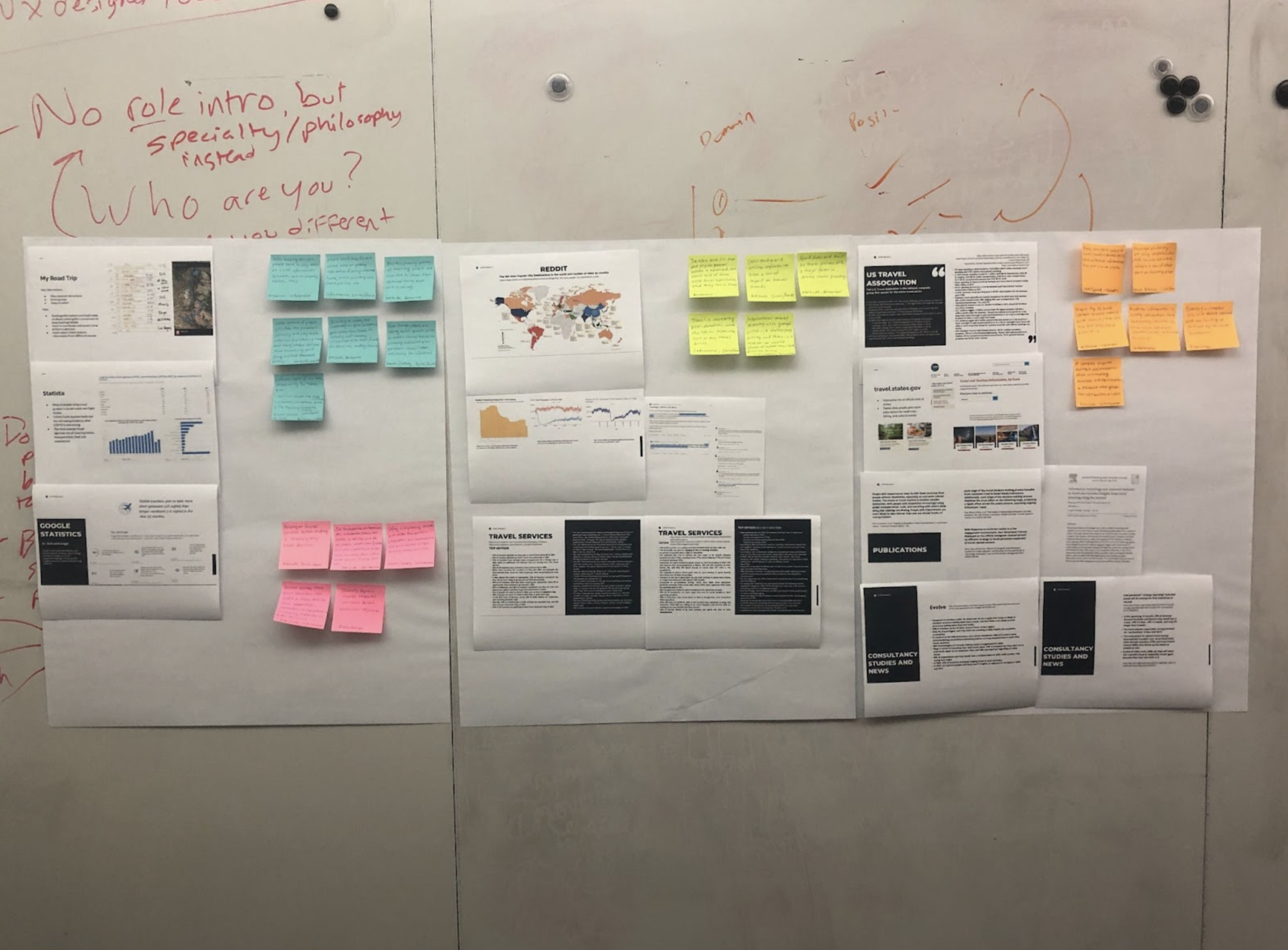
Background Research
What are their traveling patterns?
We started our research process with a series of background research including experiential research, literature, and informal or academic informational research.
People with disability have a different pattern of traveling than fully abled body people. They are facing more challenges and inconveniences than others. A key insight from the research of the United States Department of Transportation is…
People with disabilities make fewer trips per day on average than people without disabilities.
Research
Contextual Inquiry
(Directed Storytelling)
How do they feel about the traveling experience?
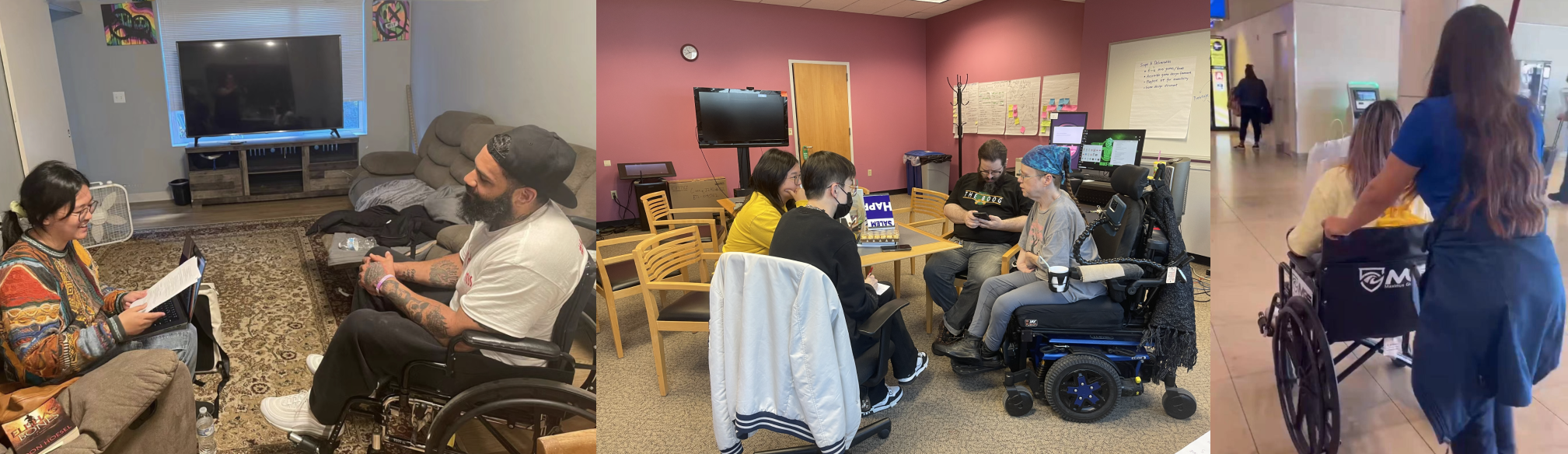
We conducted 6 sessions of directed storytelling + semi-structured interviews with 3 disabled wheelchair users and 3 temporarily disabled people. Having the participants lead the conversation and talk about their own travel experiences, we took recordings and organized interpretation notes.
Analyze
Affinity Diagram
We organized the interpretation notes (187 in total) into the affinity diagram and summarized key insights based on the diagram. The notes are categorized into four sessions: traveling habits, challenges, expectations, and others.

Synthesize
Empathy Map
Look into the details…
Based on the background research and affinity diagram, we decided to use the empathy map as a model to conclude our findings. We concluded 5 key insights from the analyzing and synthesizing steps. The following 3 are the most important ones and largely shaped the design solutions.
↳
Click to enlarge
Synthesize
Key Insights
Travelers with wheelchairs are facing hassles when curating accessibility information for trips.
— “Some facilities, even marked as Accessible, are actually not for me.
— “In my situation … we need a family-accessible restroom instead of regular ones.
[Efficiency] Travelers with wheelchairs are unsatisfied with the redundant process of accessibility acquisition.
— “I need to call them to make sure they have registered all my needs.
— “It’s definitely time-consuming…
[Uncertainty] The sense of uncertainty about receiving support/service negatively affects their experience.
— “I could only cancel because I’m unsure if they offer the scooter service.
— “I would not go out by myself unless someone … helps me through the trip.

Problem Reframe
“ How might we help people traveling with wheelchairs to 1)increase the efficiency of information curating and 2)reduce the uncertainty of information for a trip?
Ideate & Test
Storyboard & Speed Dating
How do they feel about these potential solutions?
We each used storyboards to ideate solutions based on specific user needs and conducted 8 speed-dating sessions for further investigation. I took the lead in ideating and storyboarding solutions for increasing accommodation filtering & booking efficiency.
Click the images to enlarge
Synthesize
Walk the Wall & Insights
Based on the individual speed dating sessions, we sum up and synthesize the notes for the next steps. According to the notes, we also concluded key insights.
↳
Visual information (eg. photos, street views) is more reliable and informative for people with A11Y needs.
Mobility-challenged travelers value and prefer filtered or personalized A11Y information.
Key Insights
Problem Reframe
“ How might we design a system to prioritize visual information and filter information for people traveling with wheelchairs?
Discover & Validate
Survey
Validate their needs & What are their technology touchpoints?
We designed and conducted the survey to:
Validate our critical insight — people with disability have trouble finding reliable information for travel.
Uncover technology touchpoints of people with mobility disabilities on a larger scale.
I recruited survey participants from Reddit, groups of r/spinal cord injury and r/cerebralpalsy; and I also filtered qualified participants from Prolific, the online research platform. We collected 34 survey results in total.
↳
85.3% of participants need help finding reliable accessibility information for traveling.
More than 75% of participants use Google Maps and hotel booking platforms for travel.

Prototype
Parallel Prototyping
To explore possible solutions…
Based on the speed dating and survey results, we summarized key pain points we may include in our final design and developed different prototypes individually (different proposals in directions or platforms). Then, we tested and evaluated the different prototypes and finalize the design decision.
After several test and evaluation sessions and the incorporation of previous research insights, we decided to root our final solution in prototype 4, a redesign of the accessibility toggle in Google Maps.
↳
Click to enlarge
Proposal 1.
A11Y travel APP
A Yelp-like mobile app that synthesizes all the accessibility information for travel destinations and local services.
Pros: filtered information, ‘one-stop shop’ for people with disability
Proposal 2.
A11Y travel - Chrome plugin
A Chrome plugin to extract accessibility information and visual information (photo, street view, etc)
Pros: keep the current touchpoint, simplified information curation
Proposal 3.
A11Y travel in a pocket
A mobile app to collect and save information on travel destinations
Pros: simplified information curation
Proposal 4.
A11Y Google Maps
Google Maps’ accessibility redesign
Pros: keep the current touchpoint, the short learning curve for the new product/function, simplified information curation process
✓
Prototype
Final Solution:
A11Y Feature Redesign
Our final design is based on Google Maps. We implemented the Material Design system for visual and interaction; according to our survey, more than 75% of disabled people (wheel-chair users) use Google Maps for travel planning or during their trips.
With our design solution, we do not want to change the technology touchpoints and the context. Within the widely used platform, people with disabilities can easily access and learn new features.
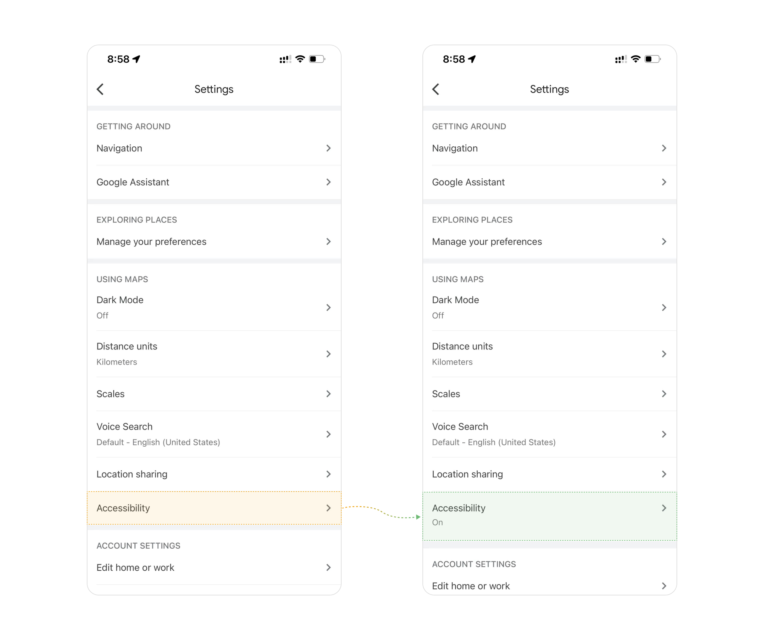

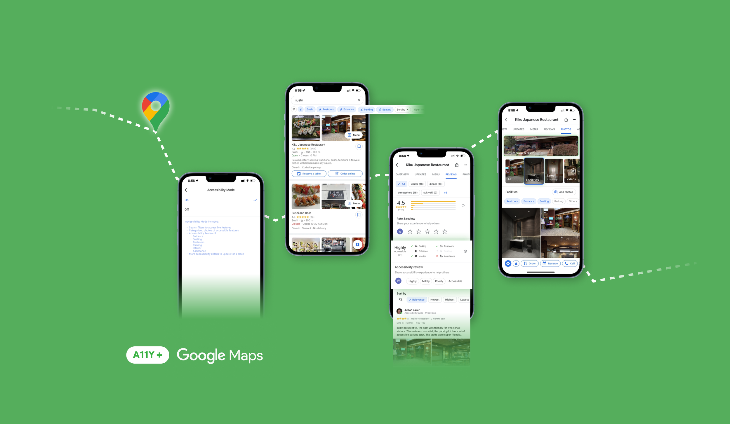
Accessibility Mode Toggle
We redesigned the accessibility toggle in the settings menu of Google Maps. Now the toggle is more explicit and lists more descriptions of the functions and features.

Accessibility Filters
Now in the Accessibility mode, users can use the added toggle to sort Wheelchair ramps, Accessible restrooms, Accessible parking, Wheelchair seating, etc.

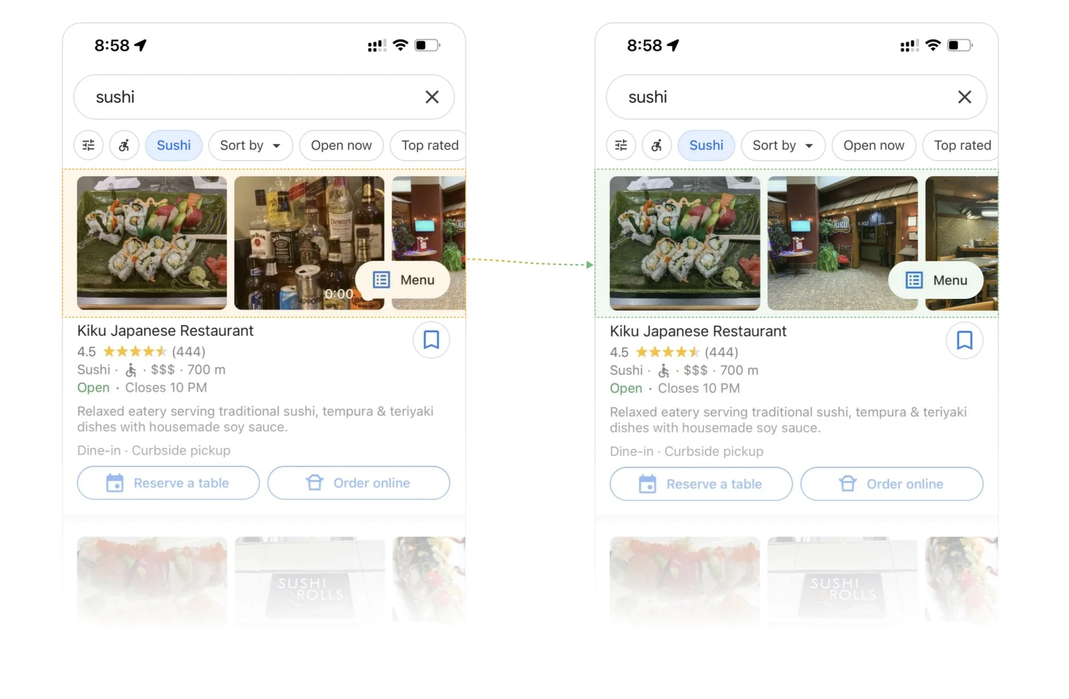
Accessibility Mode - Photos
Prioritized street-view photos and accessibility pictures to improve the ease and inclusiveness of travel searches. For the cover photo, we slightly changed the order of uploaded images; prioritized interior and facility photos.


Accessibility Mode - Reviews
In the redesigned accessibility mode, users can access valuable, detailed ratings about various accessibility facilities.
Evaluation
Usability test:
Testing + SUS
We conducted an in-person usability testing study on 8 participants. Each participant was given the following task to be accomplished using both the real Google Maps and our redesigned prototype. After using the prototype, they will fill out the survey for System Usability Score (SUS).
The participant had to figure out if Kiku Japanese Restaurant in Pittsburgh is suitable for their friend Alex to dine out with tonight. Alex is a wheelchair-bound individual, who needs accessible entrance, restroom, and seating.
Main Goal: Capture usability issues if any, and validate the designed workflow
Honest signals are measured by:
1. Time spent to complete the task
2. The number of steps taken
3. Whether the participant is able to complete the task without leaving the app

Our prototype has a System Usability Score of 87.5.
1.
↳
Only 1 of 8 participants jumped to other platforms for completing the given task with our prototype (compared to 8 of 8 with original Google Maps).
2.
Design for Accessibility
Research and design for accessibility is a time and resources consuming process. The only way to generate insights and design proper solutions for people with special needs is to talk with them, uncover the details, and empathize with them. Besides, establishing trust between researchers (and designers) and people with disability is essential for starting conversations.
Takeaways
Testing and retrospective
From our testing sessions, we have learned that asking participants to do the same task might not be the ideal approach to test the honest signals. Specifically, we noticed that for many of our participants, the amount of time taken the finish the task is significantly shorter in the second round, regardless of the type of prototype. This suggested that our current method introduced learning effects, which prevents us from capturing the most accurate results.